Table of Contents
Why Some Older Photographers Oversaturate, and What to Do About It
I am 65 years old as I write this. I have been a photographer for more than five decades, and I still care deeply about the quality of my work. I also deeply respect many photographers in their 70s and beyond whose experience, commitment, and creative lives I admire.
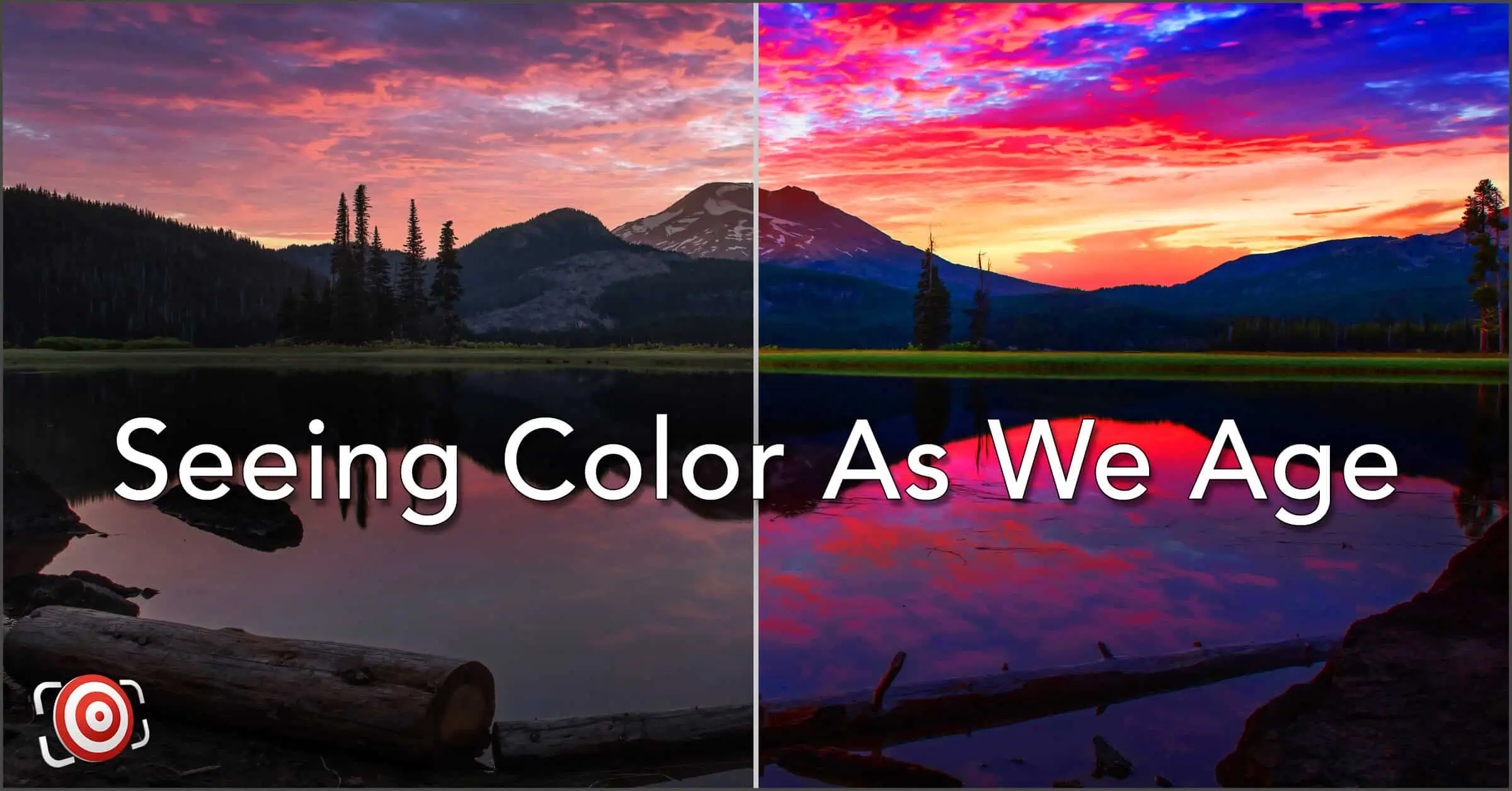
This article exists because I started noticing something in the work of these older photographers that made me uncomfortable. What I didn’t realize at first was how aging eyes and color perception in photography are quietly connected.
I began seeing images that felt oversaturated, not stylized, and not expressive. The color in these images was pushed too far, distracting from the content. Honestly, it often felt garish, crunchy, overcooked, and artificial.
At first, I assumed it was a matter of taste. Then a more complex thought crept in.
What if I am doing the same thing and can’t see it in my own photos?
That question sent me into research on vision science, perceptual psychology, and aging. What I discovered was reassuring, humbling, and frankly unavoidable.
What I learned is that this is not a taste problem. It is a perception problem. And it happens quietly as we age.
This Is Not About Style or Judgment
Let’s clear something up early. I am not about telling anyone how their photographs should look. Saturation is not bad. Bold color is not wrong. Just look at my work – I LOVE COLOR! This is not an argument for neutrality or muted images. Personal style matters, and it always will.
This article explores how aging eyes alter the information delivered to the brain, and how the brain compensates without asking for permission.
Your judgment does not suddenly decline with age. Your visual input does. That distinction matters.
What Changes as Our Eyes Age, in Plain Language
As we get older, several small changes occur simultaneously. To add to the challenge, these changes don’t start at the same age for everyone, and they don’t progress the same way for every photographer.
- Less light reaches the retina because the pupil gets smaller.
- The lens inside the eye hardens and slowly yellows.
- Blue and violet light are absorbed more than other colors.
- Contrast sensitivity declines.
- Rods and cones become less sensitive.
- Fine color discrimination weakens.
None of these changes is dramatic on its own, but together, they add up.
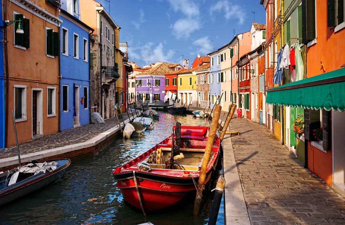
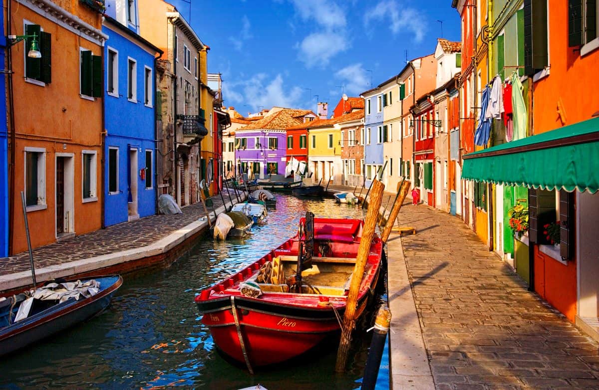
The image reaching your brain becomes dimmer, flatter, and less colorful, especially in darker tones and especially in blues and blue-greens.
Your brain does what it has always done. It compensates, without you being aware that it is doing so.
Why Color Perception Changes First
Research shows a steady increase in color discrimination errors from roughly age 30 through 80. The most significant losses occur along the blue–yellow axis of color perception.
In practical terms, blue is the first color older eyes lose sensitivity to.
This loss is uneven. Subtle blues go first. Shadow color goes next. Fine differences disappear long before obvious ones. Contrast drops before sharpness.
So when we sit down to edit, colors feel weaker than they actually are.
Saturation starts to feel necessary.
Why Oversaturation Feels Correct
When an older photographer increases saturation, it does not feel like exaggeration. It feels like a correction. This truth is a hard pill to swallow and often the hardest to accept.
The image finally looks the way the brain expects the world to look. That feeling of relief reinforces the edit.
To the photographer, the photograph feels balanced. To those who view it, it can feel loud.
This is often the reason that feedback from others is dismissed. The photographer is not defending ego. They are defending perception.
What Exactly Is Correct Color? This Is The Challenge
Before we go any further, we need to acknowledge something important.
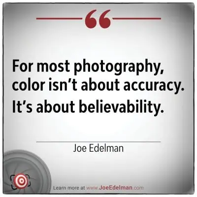
For most photographs, there is no single definition of correct color.
Photography is not laboratory work. Outside of a few specialized genres, such as scientific imaging, medical documentation, forensic work, or strict product reproduction, color accuracy is not absolute.
It is interpretive.
We warm sunset images. We shape the skin tones in portraits. We use color to guide attention and support mood. That flexibility is part of the creative process, and it always will be.
So when this article talks about oversaturation, it is not about breaking rules. For most photography, the only rules apply to physics. This discussion is about creative and subjective choices.
The More Useful Question
The real question is not, “Is this accurate?”
The more helpful question is:
Does this look believable to most people?
- Not dramatic.
- Not exciting.
- Believable.
When color moves past the point where it supports the subject and begins to draw attention to itself, viewers notice, even if they cannot explain why. The image may feel loud, artificial, or simply “a bit much.”
That reaction is not about correctness. It is about trust.
Why This Matters Here
When our eyes make colors feel weaker than they actually are, we compensate in good faith. The edits feel necessary. The image finally feels right.
This is where aging vision enters the conversation. The challenge is that what feels right to the photographer may no longer align with how others receive the image.
That gap is not a failure of taste. It is a mismatch between perception and the audience.
Alignment, Not Restraint
The goal is not to drain your work of color.
The goal is to ensure that your intent reaches the viewer intact.
Bold color that serves the image still works. Expressive color still belongs. But when color becomes the message instead of supporting it, the photograph changes, often without the photographer realizing it.
That is why awareness matters.
Not to limit creativity, but to preserve it.
A Self-Diagnostic Checklist
This checklist is not a verdict. It is a mirror.
Answer honestly, without judgment.
- Do I routinely add saturation or vibrance to nearly every image?
- Do my images feel alive on my monitor but intense on other devices?
- Do blues and teals need extra help to look normal?
- Do shadows feel dull unless I push color?
- Do people describe my work as “punchy” more often than “natural”?
- Do I prefer warmer white balances more than I used to?
- Do I rarely reduce saturation after adding it?
One “yes” means nothing. Several “yes” answers suggest perception may be influencing decisions.
Awareness is the win.
The One-Minute Reality Check
Try this with a recent image you love.
- Duplicate the file or make a virtual copy.
- Reduce global saturation by 10-15%.
- Walk away for one minute.
- Come back and compare.
If the reduced version feels calmer but still complete, that tells you something worthwhile.
Not something shameful. Something actionable.
Practical Editing Safeguards That Protect Your Vision Without Changing Your Style
Awareness helps, but awareness alone does not change behavior. Perception is stubborn, and habits built around compensation are even more stubborn.
Think of these safeguards as calibration tools, not rules.
Separate Seeing From Deciding
Make your creative decisions first. Then confirm them with objective cues.
That might mean checking numeric saturation values, histograms, or known neutral references after you make the edit, not before.
Feel should lead. Feel should not work alone.
Use Conservative Defaults, Then Push With Intention
If every image starts with added saturation or vibrance, saturation stops being a choice and becomes a habit.
Lower your default saturation and vibrance starting points. Push color deliberately when it serves the image.
If saturation is always added, it is no longer intentional. For example, if you have a “secret sauce” of +30 vibrance and +4 saturation that you automatically add to every image.
Treat Blues and Teals as High-Risk Colors
Age-related color loss affects blue sensitivity first. That makes blues and blue-greens the most likely colors to be overcorrected.
Before pushing blue or teal, toggle the adjustment on and off.
Ask one question: Does this clarify the image, or does it announce itself?
If blue draws attention to itself, it is probably too far.
Use Shadow Color as an Early Warning System
Chroma sensitivity drops in darker tones before it drops elsewhere.
Temporarily increase exposure or brightness to evaluate the shadow color honestly. Then return exposure to normal.
If shadows need saturation to exist, something else needs attention.
Build Time Into Your Workflow
Time is one of the most effective calibration tools you have.
Step away after color work. Revisit the image later or the next day.
If you still love the color tomorrow, it is probably honest.
Use One Trusted External Reference
Choose one person whose taste you trust.
Ask a specific question, not “What do you think?”
“Does the color feel natural or pushed?”
One calibrated voice beats ten opinions. Please don’t go to social media for help.
Ask One Final Question Before Export
Duplicate the image. Reduce global saturation by 10-15%.
Ask yourself: Does anything essential disappear?
Essential color survives restraint.
Why the World Looks Blue After Cataract Surgery
Many people report the same thing after cataract surgery.
“Everything looks blue.” “Whites look icy.” “The world feels overly crisp.”
As we age, the lens inside the eye yellows and absorbs short-wavelength light, especially blue. Cataracts dramatically increase that filtering.
During surgery, the clouded lens is replaced with a clear artificial one. Suddenly, blue light floods back in.
Nothing about the world changed. The filter was removed.
That dramatic shift proves something important. If removing a lens can change color perception that much, aging lenses are altering perception long before cataracts are removed.
The difference is speed. Cataract surgery is sudden. Aging is slow and easy to miss.
The Last Frame: Why This Conversation Matters
This is not about calling out peers. It is about protecting the integrity of our work.
Experience does not expire. But perception needs recalibration. The goal is not to edit like you did at age 30. It is to edit like yourself, with awareness.
Your best work is not behind you, but it does deserve clear eyes.
I hope you found this information useful. Now go pick up that camera and shoot something! Because – “Your BEST shot is your NEXT shot!” — Joe Edelman